
 nisha kittles
Design Leader · AI Creative Strategist · Creative Technologist · Creative Consultant
Explore my work.
Creative direction, accessibility leadership and AI workflows.
Explore the responsibilities, decisions and design behind the work.
Selected work
Creative leadership.
Across brands, teams and systems.
Campaign direction, brand systems, accessibility ownership and creative technology—supported by a range of visual work.
Technical possibilities.
AI-Powered Scaling & Resizing ↗
60–70% less designer production time in testing
Claude · Figma MCP · Weavy
From Creative References to Paid Media ↗
Client-work prototype · Built in Figma Weave
DTC product marketing · Creative iteration
A shared identity.Campaign identity · Partner enablement
Mental Health Campaign Rebrand & Partner Toolkit ↗
Art Director
Campaign identity · Partner enablement
includes people.Process · Requirements · Training
Accessibility at Scale ↗
Owning accessibility process, requirements and training across an entire digital marketing engagement.
Nationwide reach.Nationwide campaign · 50+ assets
Murphy USA — Great Futures Fueled Here ↗
Senior Graphic Designer → Art Director
Nationwide campaign · 50+ assets
Microsoft — The Power of Teams ↗
Design Leader
Campaign design · Creative direction
A clear message.Seasonal campaign · Email design
Microsoft Holiday Email Campaign ↗
Design Leader
Seasonal campaign · Email design
customers.Email nurture · Landing page
Uber Eats — Reach More Customers ↗
Email & Landing Page Design · Creative Strategy
Email nurture · Landing page
A stronger journey.Email campaign · Rebrand · Optimization
Nurture Email Campaign — Rebrand & Optimization ↗
Design Leadership
Email campaign · Rebrand · Optimization
More people included.Branded website · WCAG compliance
A More Accessible Nonprofit Website ↗
Website Accessibility
Branded website · WCAG compliance

Too Many Rules ↗
A children’s book I wrote and illustrated.
Original storytelling · Children’s illustration

Ink Atlanta — Editorial & Visual Design ↗
An expressive exploration of tattoo culture, typography and image-led storytelling.

15 HR Emojis That Should Exist ↗
CareerBuilder · A visual language for the working world.
Capital One DevExchange ↗
Motion-led communication for a developer platform.

Given Imaging Medical Textbook ↗
Editorial hierarchy for complex medical information.
Design Leadership
Murphy USA — Great Futures Fueled Here
I advanced from Senior Graphic Designer to Art Director on Great Futures Fueled Here, taking on creative-direction responsibility in later phases of a nationwide campaign spanning more than 50 assets.
A national campaign, encountered locally
Great Futures Fueled Here brought a fundraising message into gas stations across America. The creative challenge was one of scale and context: a campaign had to feel connected across more than 50 assets while communicating in the everyday environment where customers encountered it.
Progression into creative direction
I began as Senior Graphic Designer and was promoted to Art Director for later phases. My responsibility expanded from senior design into art direction as the campaign evolved. The progression reflects the creative trust and broader responsibility I took on within the engagement.
Creative work across disciplines
The creative team included three junior designers, a marketing manager, a copywriter and a strategy consultant. My senior-design and later art-direction roles connected the visual work with messaging, marketing and strategy across successive campaign phases.
Leadership perspective
A nationwide campaign spanning 50+ assets shows the breadth of the assignment. My progression into art direction shows growing creative responsibility across successive phases, grounded in the hands-on design experience I brought to the project.
Design Leadership
Microsoft Holiday Email Campaign
I led design for a Microsoft holiday email campaign, connecting seasonal creative expression with clear, recognizable brand communication.
A seasonal moment within an established brand
A holiday campaign gives an established technology brand an opportunity to communicate with a different emotional tone. The design challenge is to introduce that seasonal character while keeping the email recognizable, clear and focused.
My role: design leadership
As Design Leader, I brought creative direction to the campaign’s email design. My remit connected the seasonal campaign expression with the communication needs of the email format. Brand recognition, message hierarchy and the relationship between imagery and content frame the design challenge.
The design problem
An email is experienced as a sequence: the first impression, the main message and the invitation to continue. Seasonal creative adds another layer to that sequence. The useful design question is how the holiday expression supports the communication, and how the communication holds together as an email.
Leadership perspective
This project adds seasonal campaign work to my design-leadership practice. It connects brand sensitivity with the practical demands of email communication, alongside my broader experience in nurture campaigns and digital design.
Design Leadership
Microsoft — The Power of Teams
I led design for Microsoft’s The Power of Teams campaign, connecting a collaboration message with its creative expression.
A collaboration message with a simple expression
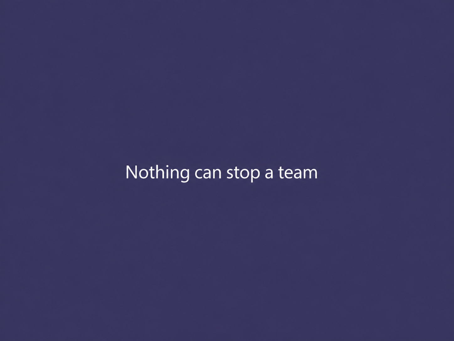
The Power of Teams campaign centers on the strength of people working together. The featured line, “Nothing can stop a team,” makes that idea direct and human. It gives the campaign a message that can be understood without a long explanation of the product.
My role: design leadership
My role was Design Leader. I brought creative judgment to how the collaboration message was expressed through campaign design. The leadership story is the connection between the idea and its visual direction: a direct human message supported by a restrained creative expression.
The creative expression
The selected purple frame uses a restrained visual language: a single statement, generous space and white typography. The composition gives the message the attention. Purple establishes the visual setting while the line carries the emotional idea of collective capability.
Leadership perspective
The project illustrates a part of my practice where simplicity carries the concept. Design leadership includes recognizing when a strong message needs space, hierarchy and a coherent visual setting to do its work.
Design Leadership
Mental Health Campaign Rebrand & Partner Toolkit
I art-directed the Mental Health Care Works campaign rebrand and created a partner toolkit, connecting a distinctive campaign identity with practical guidance for partner use.
A campaign identity that partners could use
Mental Health Care Works needed both a renewed campaign expression and a way for other organizations to participate. I approached this as an art-direction and brand-system assignment: the campaign identity and the partner toolkit had to support each other.
My role: art direction and rebranding
I rebranded the campaign and created its partner toolkit. The work connected campaign marks, color guidance and brand-use rules with practical examples of how partner identities could sit alongside the cause. This extended the assignment beyond a standalone logo into a system for application.
Making partner inclusion explicit
The partner lockup work explored wordmark and logo relationships, partner-first configurations and supporting attribution language. These decisions address a real co-branding problem: giving a partner visibility while keeping the campaign recognizable and clarifying the relationship between the brands.
A toolkit organized around use
The toolkit design brought together brand guidance, ways to participate and marketing-resource sections. Its structure connected the identity to cause marketing, employee engagement, social communication, and print and digital applications. The reference materials show the design development of that framework.
Leadership perspective
My ownership spanned the campaign rebrand and the partner toolkit. That connects creative direction with a reusable brand system: an identity supported by the guidance and examples partner organizations need to apply it consistently.
Design Leadership
Nurture Email Campaign — Rebrand & Optimization
I connected a nurture campaign rebrand with email optimization for a financial software brand, considering the brand expression and the communication journey together.
A rebrand across a nurture journey
I connected a nurture campaign rebrand with email optimization for a financial software brand, considering the brand expression and the communication journey together. The assignment joined two related needs: updating the visual expression and improving how the campaign communicated over a sequence of emails.
My contribution
I worked across the campaign rebrand and email optimization. This positioned the work between brand design and experience design: each email needed to belong to the refreshed brand while also playing a role in an ongoing communication journey.
The design problem
A nurture campaign is more than a collection of isolated messages. It has to balance continuity with progression. Brand expression helps a sequence feel connected; information hierarchy helps an individual email communicate its purpose. Considering both together gives the redesign a clearer focus than a purely cosmetic refresh.
Leadership perspective
This work connects visual craft with a broader campaign experience. It shows my involvement in adapting a brand to email communication and optimizing a nurture campaign, without reducing the assignment to a single screen or template.
Design Leadership
Uber Eats — Reach More Customers
I combined creative strategy with email nurture and landing-page design for Uber Eats’ Reach More Customers campaign, connecting the campaign proposition across the customer journey.
One campaign across connected touchpoints
Reach More Customers brought together email nurture and landing-page design. The central creative challenge was continuity: the message that introduces an opportunity in an email needs to connect with the experience people find after they follow it.
My contribution: strategy and design
My work combined creative strategy with the design of the nurture emails and landing page. That scope let me consider the communication across touchpoints, connecting the customer-growth proposition with both the email experience and the destination that followed.
The communication journey
Email introduces the proposition and creates a reason to continue. The landing page gives that proposition more room. Treating these as related parts of the campaign creates a useful design lens for message hierarchy, supporting information and the next action, rather than judging each asset in isolation.
Leadership perspective
The project connects creative strategy with hands-on digital design. It reflects my ability to work across a campaign journey, bringing the message and the visual experience together across email nurture and a landing-page destination.
Accessibility & Consulting
A More Accessible Nonprofit Website
My accessibility work with an adaptive sports nonprofit covered WCAG compliance across its entire branded website, bringing brand and accessibility into the same digital experience.
Accessibility across a whole branded website
My accessibility work with an adaptive sports nonprofit covered WCAG compliance across its entire branded website, bringing brand and accessibility into the same digital experience. The scope was site-wide, connecting the organization’s digital presence with accessibility considerations across the website experience.
My contribution
My contribution addressed accessibility across the branded website as a whole. The scope required a site-wide view of the experience, connecting WCAG compliance work with the way the organization presented itself online.
The design challenge
A branded website communicates an organization’s identity, but it also has to serve the people using it. In this project, accessibility was part of that broader responsibility. The case connects my creative design practice with work on WCAG compliance in a nonprofit setting.
Leadership perspective
This engagement adds a website-wide application of accessibility to my portfolio. Alongside my enterprise accessibility-SME work, it shows the range of contexts in which I bring accessibility expertise into digital and creative work.
01 / Creative Technology
Design leadership meets creative technology.
My work for an unnamed technology company brings together my roles as Design Lead, Creative Technologist and FDE.
Certified Claude practitioner
I hold Claude Certified Associate – Foundations and Claude Certified Architect – Foundations credentials and participate in the Claude Partner Network through my employer. The network supports enterprise adoption through partner training and technical support.
About the Claude Partner Network ↗Explore Creative Systems & AI Workflows ↗02 / Creative Consulting & Accessibility
Creative direction. Accessibility expertise.
I bring expert-level Figma, UX/UI and creative design abilities to my consulting practice. I’ve served as an accessibility subject matter expert and have experience leading collaborative workshops.
- Accessibility SMEExperience serving as a subject matter expert alongside my design practice.
- UX/UI & prototypingExpert-level Figma and UX/UI skills, with experience building prototypes.
- Workshop facilitationExperience leading workshops using FigJam and Microsoft Whiteboard in Teams.
- AI creative workflowsHands-on experience using Claude with Figma MCP.
Explore the accessibility case study ↗
03 / Design Leadership · Selected experience
Creative direction, grounded in design expertise.
CareerBuilder emojis ↗ Capital One animation ↗ Given Imaging textbook ↗
A national fundraising campaign
I began as Senior Graphic Designer and was promoted to Art Director for later phases. Our team created more than 50 campaign assets for use at gas stations nationwide.
The team included three junior designers, a marketing manager, a copywriter and a strategy consultant.
Accessibility · Creative Consulting
Accessibility at Scale
As the accessibility SME, I owned process, requirements and training for all digital marketing and creative assets across an entire technology client engagement.
An engagement-wide responsibility
I served as the accessibility subject matter expert for a technology client engagement. My remit covered all digital marketing and creative assets across the entire project. Accessibility was therefore part of the wider delivery environment, with responsibilities extending beyond an individual design or asset.
Owning the process
I owned the engagement’s accessibility process alongside its requirements and training. My responsibility covered the operating approach surrounding the creative work, with a remit extending across all digital marketing and assets for the project.
Connecting requirements and training
I also owned accessibility requirements and training. Those are connected responsibilities: requirements establish what work needs to meet, while training supports the people working with those expectations. Bringing both into my remit connected subject-matter expertise with the needs of a creative engagement.
Leadership across the creative system
The significance of this work is its breadth. Process, requirements and training were all within my ownership, across digital marketing and assets for the whole project. This is accessibility leadership at the level of the engagement, alongside my hands-on UX/UI and creative-design practice.
AI Creative Strategy · Design Leadership · Creative Technology
AI-Powered Scaling & Resizing
I created and connected an AI-assisted workflow for scaling and resizing creative across paid media, organic social and other unpaid channels, bringing brand governance, accessibility review and delivery requirements into the same flow.
One brief. Many possibilities.
A connected scaling and resizing workflow across paid and unpaid channels, from a usable interface to reviewed, delivery-ready assets.
01 Define & guide
A usable interface for nontechnical people.
Brand knowledge and rules within the workflow.
02 Connect & adapt
Connected with the flow; other LLMs also tested.
Connected tools for resizing and scaling digital marketing creative.
Language adaptation included in the workflow.
03 Review & deliver
Organized asset outputs for delivery.
Checks and approval around the creative work.
Paid media, organic social and retail channels, including Facebook and LinkedIn.
The challenge: scale the whole workflow
Scaling and resizing creative across paid and unpaid channels involves more than changing dimensions. The workflow had to account for channel variations, translation, file naming and delivery taxonomy, with brand governance and an accessibility approval and review layer built into the process.
My role: connect the system and make it usable
I worked with Claude to create and connect the flow, linking the LLM with Figma MCP and Weavy. I also tested the approach with other LLMs. Drawing on my front-end design experience, I helped create a working interface so people without specialist technical skills could use the workflow.
Governance alongside generation
The workflow included brand governance and a knowledge graph, connecting creative production with the context needed to guide it. Translation, naming and taxonomy were part of the delivery process, while accessibility and compliance checks sat within an approval and review layer.
A system designed around people
The working UI was an important part of the solution. Connecting tools established the capability; the interface gave nontechnical people a way to use it. My contribution brought workflow integration, design experience and usability into the same project.
Result: production time reduced in testing
Workflow testing showed a 60–70% reduction in designer production time. The workflow combined asset resizing and scaling with translation, brand governance, naming and taxonomy, and an accessibility approval and review layer.
Leadership perspective
This project connects my AI creative strategy and design leadership with hands-on implementation: shaping a workflow that addresses creative scale, user access, governance and delivery together.
Creative range · Editorial & Visual Design
Ink Atlanta
An expressive editorial exploration of tattoo culture, bringing together typography, imagery and a strong sense of visual identity.

A different creative register
Ink Atlanta shows a more expressive side of my design practice. Tattoo culture provides the visual subject, with the presentation moving between close-up imagery, portraiture, decorative lettering and editorial text. The work gives typography and images an active role in telling the story.
Typography with personality
The flowing Ink Atlanta wordmark sits across both monochrome and colorful imagery. In the editorial presentation, script accents work alongside more structured display and body typography. Those contrasts connect the handcrafted character of the subject with the organization needed for a reading experience.
Rhythm across the pages
The nine-page PDF shifts between full-image compositions, text-led passages and open space. Teal, purple, black and white create different moods across the presentation. Image scale and placement help distinguish the sections while maintaining the larger visual story.
Creative range
Alongside my campaign, accessibility and creative-technology work, Ink Atlanta demonstrates my range in visual expression: editorial composition, expressive typography and the relationship between imagery and narrative.
Discuss editorial and visual design ↗
Design · CareerBuilder
15 HR Emojis That Should Exist
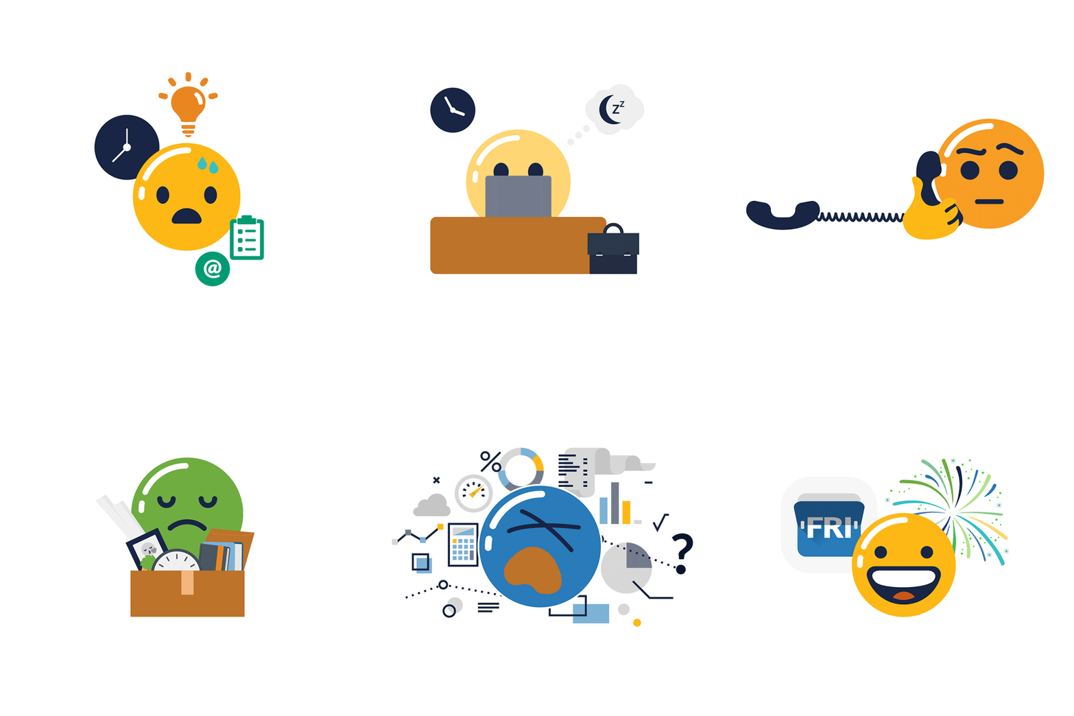
An illustrated take on the language of work, with expressive characters and a keyboard application.

From individual expressions to a shared visual language.
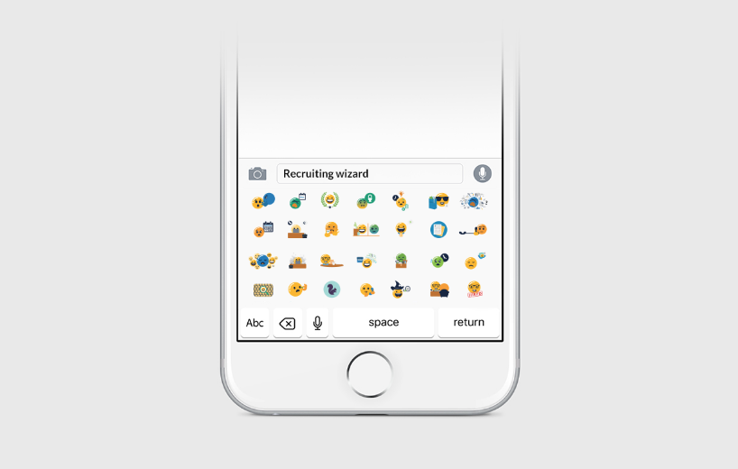
The illustration system brings workplace expressions into a familiar communication context, connecting individual characters with their keyboard application.
A visual language for workplace expression
The project imagines 15 HR emojis and places them in a phone-keyboard context. It combines illustration with a familiar interaction model: individual expressions become a small visual vocabulary that people could encounter as part of everyday communication.
Design perspective
The illustrations invite attention to character, expression and consistency across a family. The keyboard mockup adds context, showing how the individual drawings relate as a set. Together, these make the project a useful example of visual communication across both artwork and application.
Design · Motion
Capital One DevExchange
A 69-second animation communicating a financial-services developer platform through motion.
A message carried through motion
This 69-second animation extends the portfolio into time-based communication for a financial-services developer platform. Unlike a static composition, a motion piece unfolds: the audience encounters information through sequence, duration and transitions.
Design perspective
The piece offers a way to explore motion as visual communication. Its developer-platform context brings a technical subject into a format that can combine message, pacing and visual emphasis. It sits alongside my wider creative-design practice and After Effects toolkit.
Design · Editorial
Given Imaging Medical Textbook
Cover and interior design presentation for High Resolution Esophageal Manometry.


Making room for complex information.
The publication connects a distinctive cover with structured interior layouts, medical imagery and information hierarchy.
Design for sustained reading
High Resolution Esophageal Manometry brings medical information into a publication format. The project connects a cover presentation with structured interior layouts, medical imagery and an information hierarchy intended for a much denser reading experience than a campaign headline.
Design perspective
Editorial design has to support both orientation and detail. A cover creates an entry point; the interior establishes a structure for navigating complex material. This project adds that information-design dimension to a portfolio that also spans campaigns, illustration, email and motion.
My book · Authored & illustrated by Nisha Kittles
Too Many Rules
A story for children about discovering joy and freedom through self-discipline.
Written and illustrated by Nisha Kittles.
A little frustration. A bigger discovery.
What happens when a child feels surrounded by “no”? I wrote and illustrated Too Many Rules to explore that familiar tension through a young reader’s eyes. The story follows a spirited child who begins to discover how cooperation and self-discipline can create room for freedom and joy.
This is a personal expression of my creative range: connecting language, character and illustration in a story designed for children.
Buy the book on Amazon ↗Inside the visual world
Small character. Big imagination.
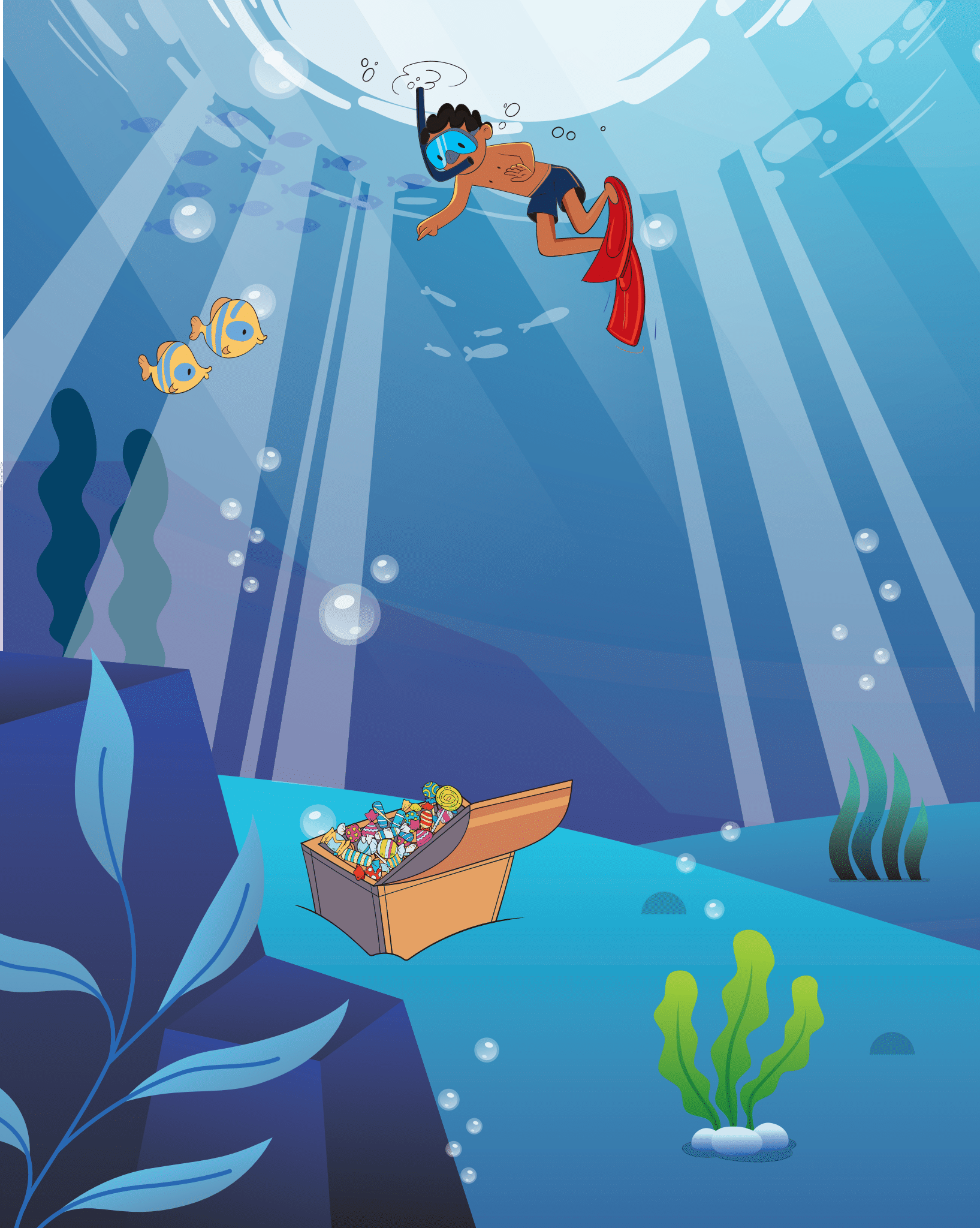
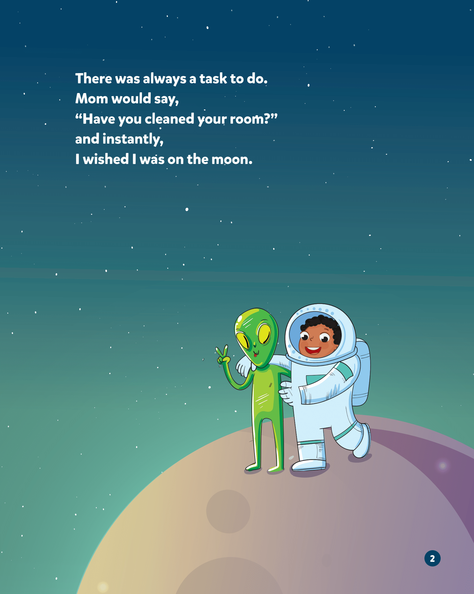
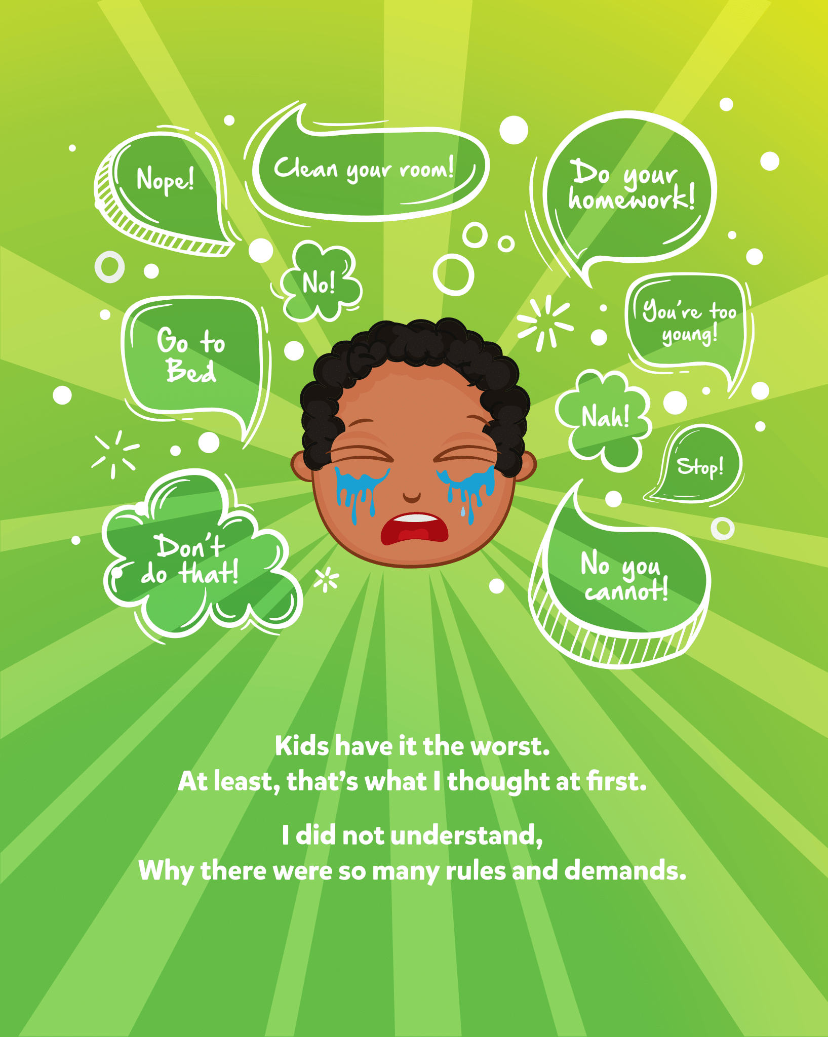
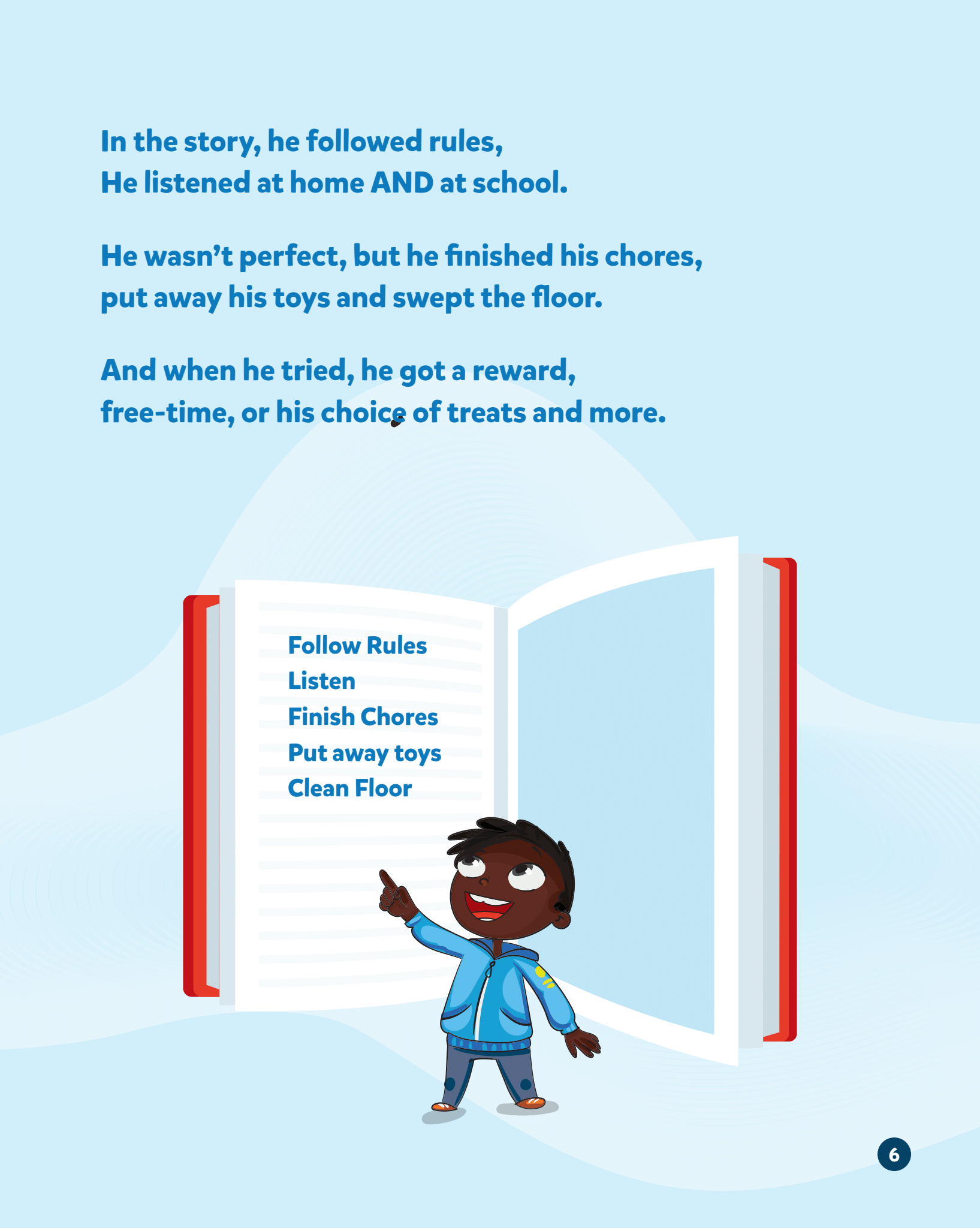
Selected illustrations and page compositions from the book’s development artwork. These show the visual exploration behind the story; some layouts differ from the published edition.
One creative voice, in words and pictures
As both author and illustrator, I brought the written story and its visual world together. The book pairs a relatable childhood question with colorful illustrations and humor, inviting conversations about patience, emotions and the purpose behind everyday rules.
Illustration with personality
The cover introduces that world through playful lettering, a character in motion and an open, colorful setting. It offers another side of my practice—expressive illustration and storytelling alongside the brand systems, campaigns and creative technology featured elsewhere in this portfolio.
A story made to be shared
Published by Bold Minds Academy, Too Many Rules is a 30-page children’s book for ages 4–8. It brings my writing and illustration into a published work readers can explore beyond this portfolio.
Creative technology · AI creative strategy · DTC marketing
From Creative References to Paid Media
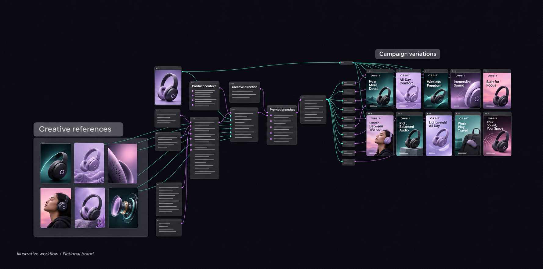
I built a complex Figma Weave workflow as a prototype for client work, connecting product context, creative references and branching prompts to explore paid-media campaign directions.
The challenge: turn product context into creative range
Direct-to-consumer (DTC) product marketing needs more than one attractive product image. A campaign needs different ways into the same proposition: a clear benefit, a striking product moment, a lifestyle context or a reason to believe. I built a client-work prototype to explore how those directions could be developed through a connected creative workflow.
My role: building the workflow in Weave
I built the workflow in Figma Weave, formerly Weavy. I connected creative references, product context and prompt direction into a branching node-based flow for paid-media creation. The design work included the logic between the stages: what information an input carries forward, where creative directions separate, and how the outputs relate back to the product.
From references to a creative system
The flow brings reference material and product information into a shared starting point, then branches into multiple creative directions. This makes the relationship between input, instruction and output visible. It also gives creative decisions a place in the system, rather than leaving every variation dependent on a disconnected prompt.
Iteration with creative intent
Weave supports exploring alternate branches, reworking outputs and adjusting the instructions behind a result. For this prototype, the useful design question was how to create room for iteration while retaining a common product context. Product prominence, message hierarchy, composition and visual tone become dimensions to review and refine—not just differences between images.
Designed for DTC product marketing
I framed the workflow around paid-media creative exploration: different product stories and visual treatments that could be compared before moving toward campaign execution. In the fictional tech example shown here, the variations explore comfort, focus, sound and everyday use. Those are illustrative creative directions, not claims about the original client’s product or campaign performance.
Why Figma Weave
Weave combines generative tools and editing steps on a connected canvas. Its broader ecosystem also includes workflows packaged as tools that can run from Figma Design. My contribution here was building the underlying Weave flow for a client-work prototype. The value is a more repeatable creative process, with room to branch, compare and refine while keeping human art direction central.
What the prototype demonstrates
This project shows how I translate a creative problem into a working workflow: connecting inputs, defining branches and bringing design judgment into AI-assisted media creation. It extends my practice from designing individual assets to designing the process behind a family of campaign directions.
Platform context: About Figma Weave · Weave tools in Figma Design.
Discuss AI creative workflows ↗Good work starts with a conversation.
Let’s talk ideas, opportunities, and what comes next.