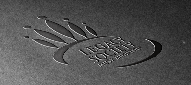
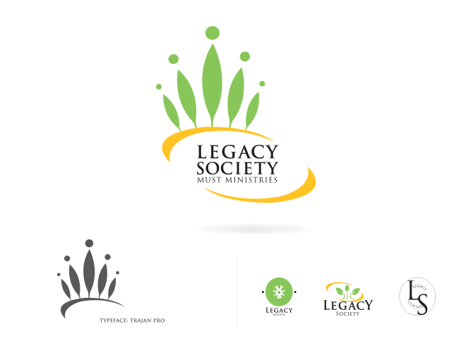
Must Ministries’ Legacy Society Logo and Brochure
Take the Guesswork Out of Designing Window Décor
___________________________
Must Ministries wanted to develop an identity for their legacy giving program, as well as a direct mail piece. We have three to five seconds to capture the attention of our audiences. In this case an audience of well established, mature, middle-aged to retired persons. Often labeled “baby boomers”, pre-retirement-ees, newly retired, and those who are seventy-four and older who’ve probably already made planned giving commitments. Studies show that this demographic has an aversion to complexity and finds it hard to relate to people who differ from themselves. They are generally adverse to risk and question legitimacy, especially those with financial obligations. But to our advantage, they do share an interest in the responsibility of family, friends, and the people of their surrounding communities.
MUST Mini has a well-established brand, often using imagery of MUST volunteers helping others. This imagery isn’t simply designed to pull at the heartstrings of their audience, but to show how their volunteers are helping those who are genuinely in need. For this particular project however, accentuating the traditional brand of the organization, creating a unique look for the Legacy Society would increase visibility and help the planned giver feel as though they are not the typical MUST donor but apart of an elite organization. In the last twenty years, images of “feed the hungry” poor children and families have flooded the market and this audience isn’t as receptive to this sort of photographical imagery. Therefore, condensing the use of photographs with the use of duotones and black and white imagery will lessen the impact of potential un- relatable images and risk, while simultaneously creating a much more refined look of formality for the newly created Legacy Society. We will use clean white space, gray highlights, juxtaposed against accents of MUST blue and gold. Consistency. No need to recreate the wheel of colors, blue often represents calm, and gold is a color of respect and wisdom. Giving the audience a platform to focus on the words, theme, and purpose of the brochure, without being cluttered.
Role: Graphic Design, Marketing Manager, Copy-Editor, Production
Comments are now closed for this article